An email newsletter should provide unique value to recipients while keeping the sender top of mind for repeat and referral business. Unfortunately, that’s often easier said than done. Let’s look at the anatomy of an email newsletter and identify the components essential for optimal success.
Bonus Content: Grab a copy of our Email Marketing Roadmap.
Sender Name and Email Address
According to MailChimp, 43 percent of recipients will report an email as spam if they’re not familiar with the sender’s name or email address. Luckily, these are two components over which you have full control.
Using your company name and email is always the safest bet. After all, your recipients opted into your newsletter because they know and trust your brand. That said, real names — always from a company email address — can add a human touch to the proceedings and give your emails a more conversational feel.
Email Subject Lines
Nothing influences email open rates more than your sender name (64 percent) and subject line (47 percent). To encourage opens, subject lines must clearly introduce enticing and relevant topics.
When crafting email subject lines, we recommend using roughly 50 characters. In general, keep it as brief as possible. Most mobile applications only display 25-30 characters, and 68 percent of emails were opened on mobile devices in 2015.
Pre-Header or Snippet
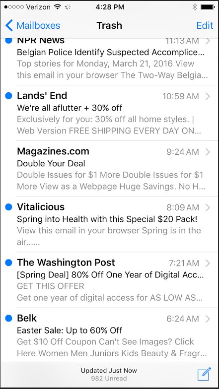
In your inbox, email subject lines are often followed by a little blurb of text known as the pre-header or snippet. Usually, this text is automatically pulled from the beginning of your email, but some providers allow you to create a customized, hidden snippet via coding.
Often, marketers overlook this component, and useless text, such as “having trouble viewing this email?” — or no text at all — appears in the snippet. This is a wasted opportunity. Your snippet should always strongly support your email subject line to help encourage the open.
Here are some examples of pre-header/snippet text.
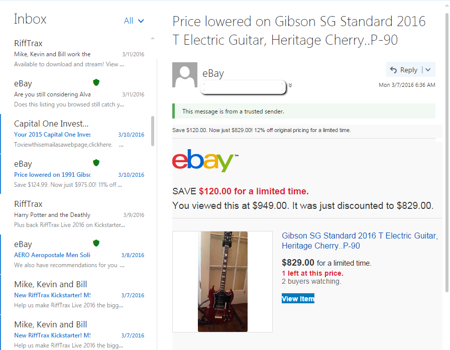
Preview Pane
In addition to the pre-header or snippet, some email clients also provide a preview pane that allows recipients to view a portion of your email before opening it. The goal here is a quick and easy brand recognition, so you’ll want to use recognizable company logos and colors. Push important items, such as the logo to the top left to ensure visibility.
Here’s an example of a preview pane in Outlook Mail (desktop).
Relevant Content
Avoid sales-oriented product placement and focus on relevant, industry-adjacent content, the kind your recipients will not only enjoy, but also want to share. Otherwise, you could lose subscribers. According to a survey by Connox, 60 percent of subscribers will cancel an email newsletter when the content isn’t interesting, and 57 percent will cancel if the content is no longer relevant.
Presentation
Text-heavy newsletters won’t cut it. Your copy should be short, to the point and easily scannable. Break things up using white space, images, clear headers and bullet points — anything that helps draw the eye to pertinent information. Your goal should be to create a fluent, cohesive presentation that leads the reader to the inevitable click-through.
Images
Since the human brain can process visual information 60,000 times faster than it can decode text, images are high on the list of email newsletter essentials. But for images to be effective, they need to be relevant to the conversation and supportive of the ultimate call to action (CTA).
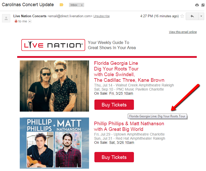
While a picture may be worth a thousand words, it’s important to remember that images don’t always display properly in email. Some email clients — and users — disable automatic image downloads entirely, and sometimes, a poor connection is the culprit. Whatever the reason, make sure you have alternative (alt) text embedded to get your message across.
In this example, the alt text “Florida Georgia Line: Dig Your Roots Tour” appears when you hover over the Buy Tickets CTA button and would appear if the image did not.
CTA
Your email newsletter will have a variety of content, so multiple CTAs aren’t out of the question. But it helps to build around a primary CTA that can inspire every other component of your email newsletter, including your secondary CTAs.
All CTAs should be actionable and clearly defined. You want your recipients to know exactly what to do next, and what to expect for their trouble.
To make it easier for readers to spot and interact with CTAs, consider using buttons. CTA buttons draw the eyes of your readers using larger fonts and visual design elements, and studies have shown buttons to increase click-through rates by as much as 28 percent.
Signature and Footer
This section of the email newsletter doesn’t always get the attention it deserves. Sure, you’re basically signing off, but this is prime marketing real estate that can be used to communicate essential information.
Depending on your layout, this section may contain several items, including:
- Company contact information
- Email preferences and unsubscribe options
- Email forwarding and social sharing buttons
- Plain text/view in browser links
Don’t think this information is important? Your company contact info and unsubscribe options are required for CAN-SPAM compliance, and social sharing buttons have been shown to increase click-through rates by 158 percent!
Wrap-up
While every email newsletter will present its own unique set of challenges, understanding the basic anatomy will help you gather the components essential for success. Of course, if you need help putting the puzzle together, we’re always happy to help!

![Better Email Etiquette Equals Better Marketing Results [16 Rules]](https://www.outboundengine.com/wp-content/uploads/shutterstock_411184843-1-400x250.jpg)